
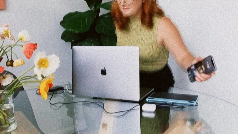
Dream Branding That Brings Your Vision to Life
Our focus is simple;
build a brand that speaks to your audience.
By getting to know your business and what drives it, we can create much more than a logo. Together we can create a storytelling brand that reflects the business’ core values, attracts your key clients and stands out in the market.
CLIENT TESTIMONIALS
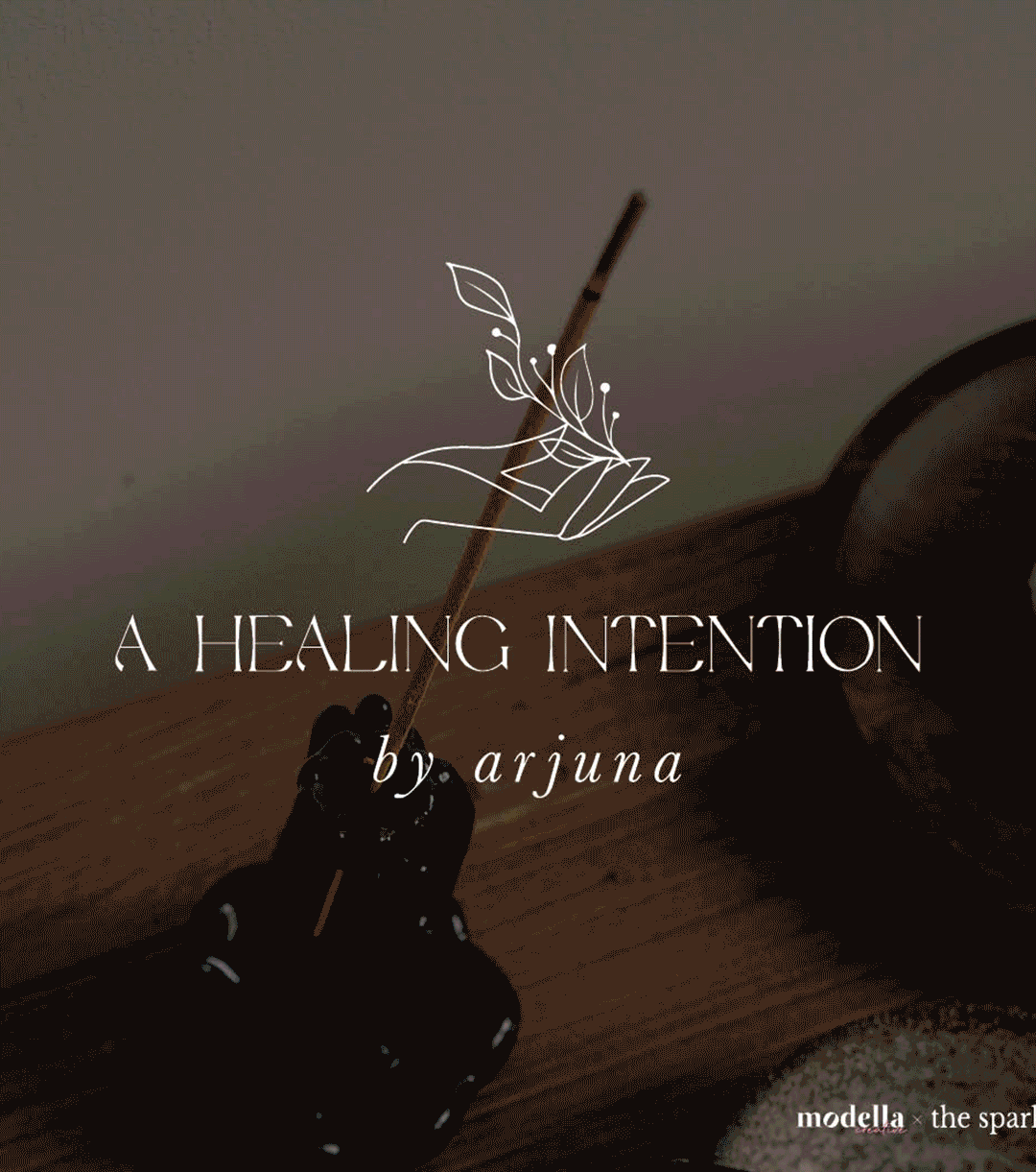
Wow wow wow!!! Are my initial thoughts. The little firefly symbol is so gorgeous. A little bit lotus flower and a little bit firefly...how did you do that!?!?!
-
Firefly Nutrition & Health Coaching
|
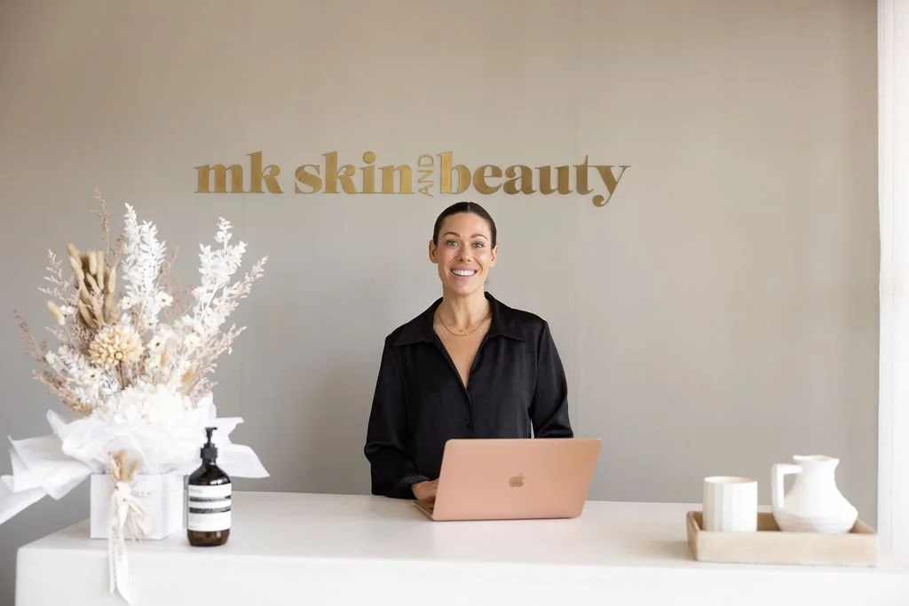
Client is obsessed with the Cottonwood logo! You're an actual Angel to me!
-
The Sparkk
|
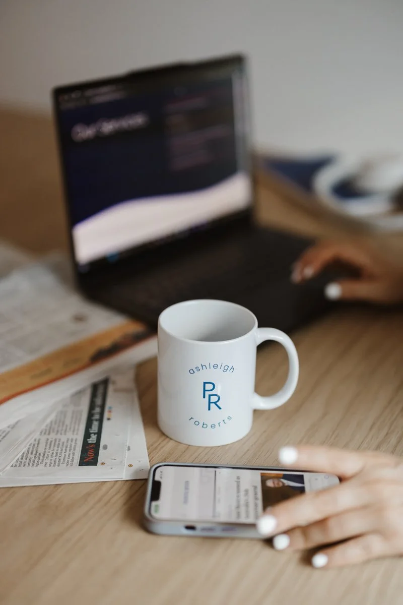
I have high praise for Molly and would not hesitate to have her in my team, again!
-
Craveable Brands
|
Wow wow wow!!! Are my initial thoughts. The little firefly symbol is so gorgeous. A little bit lotus flower and a little bit firefly...how did you do that!?!?! - Firefly Nutrition & Health Coaching | Client is obsessed with the Cottonwood logo! You're an actual Angel to me! - The Sparkk | I have high praise for Molly and would not hesitate to have her in my team, again! - Craveable Brands |

Brand Packages
We offer a number of brand packages to help get you started on creating your dream brand!
With pricing to suit every budget, let’s tell the story of your business through visual design that reflects your it’s values.
Don’t see exactly what you want? We can build a custom package to hit all your touch points
I want a logo
From $600
This package is for the business owner who already knows what they’re after and what their audience wants. It’s designed for those who want a quick turn around, with minimal back and forth to achieve a quality logo that will engage their audience.
Inclusions:
- Primary logo
- Brand icon
- 2 x rounds of revisions
I want a Brand
From $1200
This package is for the business owner who knows what they need to change their identity from ‘logo’ to brand (ooo, ahh). They’re aware of what appeals to the business’ audience and what will therefore be attractive to them as a client/customer. This package is designed to create a dynamic brand identity that can be applied across all touch points, with variation and guidance in it’s usage.
Inclusions:
- Primary logo
- Secondary logo
- Brand Icon
- Colour Palette
- Brand font family
- 3 x initial logo concepts
- 2 x rounds of revisions
- 1 x basic style guide
(incl. logos, colour palette, fonts)
I want to stand out
From $2400
This package is for the business owner who wants to align their brand with strategy and appeal directly to their audience. This brand (or rebrand), is the first step in engaging new customers and will be based in market and competitor research in order to stand out. This package has been designed to offer an overhaul of touch points to reinforce brand consistency and recognition across the your market.
Inclusions:
- Market + direct competitor study
- Primary logo
- Secondary logo
- Tertiary logo
- Brand Icon
- Complete colour palette
- Brand font family
- 3 x initial logo concepts
- 3 x rounds of revisions
- Social media logo tiles
- Email footer
- 1 x brand guidelines
(brands tone of voice, look & feel, logo usage (do’s & don’ts), colour palette (in CMYK, RGB & HEX) font family, mission statement)